If you’re a regular to my blog, you’ll have noticed some changes recently, so I thought I’d write a rather long article to talk about what exactly those changes are and then detail the process I’ve gone through in putting them into place.
It’s has by chance also turned into my longest ever article as well!
First though, a bit of recent history.
In the beginning
Alas, I’m not talking about the first verse of the Bible. but back in June 2017 I launched jakeprice.tech, and you could say I’m “celebrating” it’s two year anniversary this month, (celebrating is probably a wee bit strong!) so with that, I decided it was time to launch a whole new version, which is the subject of this post… Version 4.
I’ve worked really hard to improve just about every area of the backend and frontend, many of which are areas I have wanted to improve for ages, so I thought I’d go into a lot more detail about the process and talk about some of the things I have actually changed and improved.
So, it’s June 2017, and I’d been in my first “proper” IT job since March, and I felt it was a good time to give myself more of a presence online. It’s something I had always given a lot of thought too but had not really put it into action. In this day and age, how do you stand out? How do you convince somebody you are the person for the job? To stand any chance you have to market yourself, a bit like a business does, you can’t just apply for jobs, you have to craft every area of your online presence to put you ahead of the competition. Now to some people that sounds horrifying, but to me, this kind of thing comes naturally, so I like to think it’s relatively simple for me to create a compelling and consistent online presence. Additionally, I think it’s only going to become a more important thing to have in the future. If you’ve got years of articles to prove you know what you claim to know, you are going to be in a better place in your career.
I have always had a clear plan of where I want to get to with my career, but in many way’s I’m starting from behind. I’ve loved anything to do with computers and technology since I was young, but it wasn’t until I was nearly 27 that I actually thought, “why am I not doing this as my day job?”. Up until this point I had gone through life taking the career opportunities that came my way, mastering them, and making a real success of them, but nothing I had done was actually what I wanted to do, none of it was my passion. So my blog very much ties into this plan and serves as a place to prove what I know to people that might want to work with me, as well as a place I can share my journey in the industry and perhaps inspire other people.
It’s a Hueman
So, I went and bought a domain name, going with the rather obvious to me .tech domain, and I purchased some cheap web hosting from a company called Jolt, and then installed what had always been my platform of choice, WordPress.
At that stage, I hadn’t done any proper web design or development for years. I loved it in my teens but had very much fallen out of love with it since then. All I wanted to do was write so I went with a WordPress theme I had previously used, the excellent “Hueman” theme and after making some small adjustments to the colours and page layout it was good to go, and I launched it.
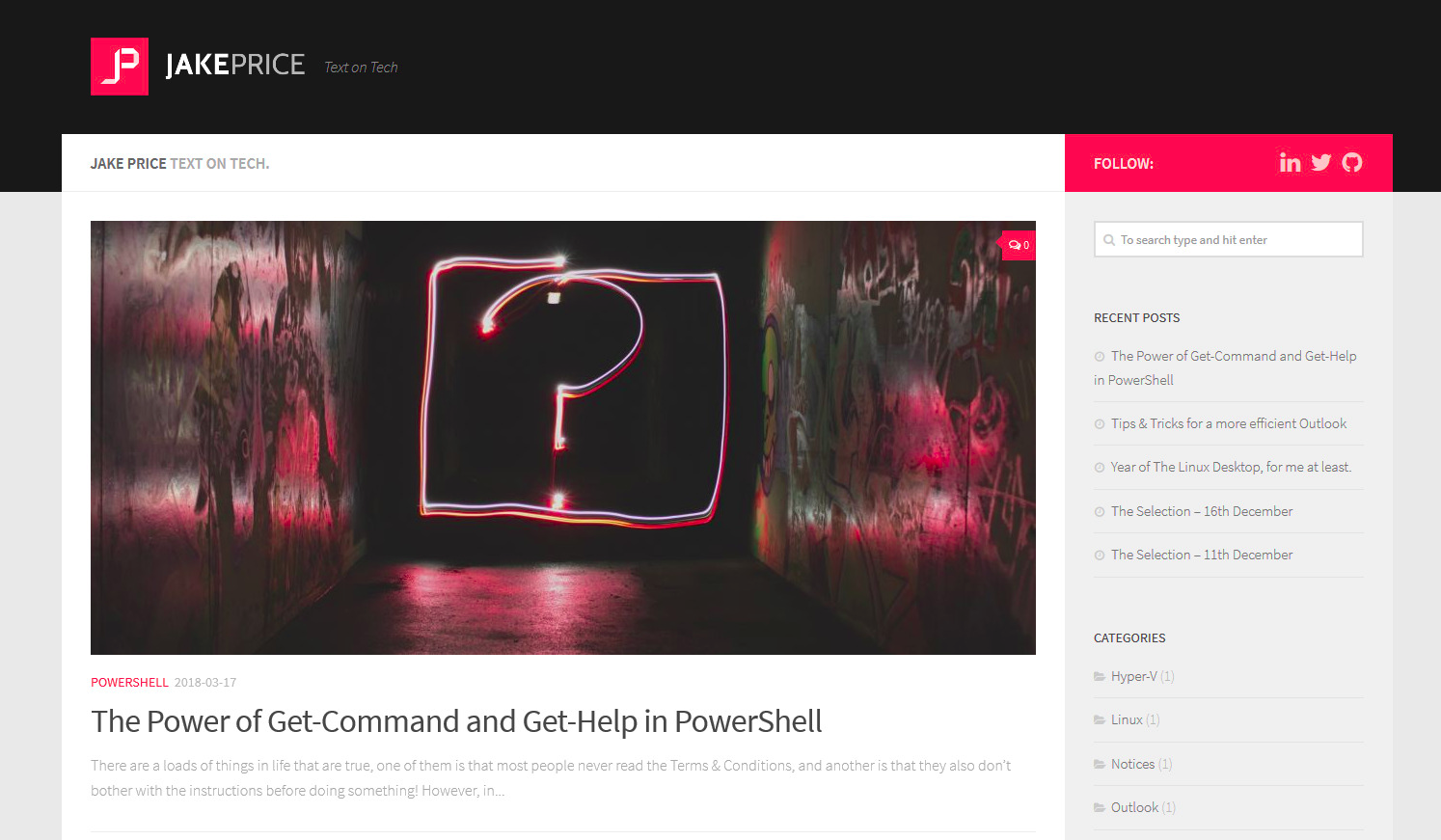
Version 1 of jakeprice.tech using the Hueman WP theme.
I thought it looked pretty smart, and it still does, but in the back of my mind, the desire to create my own design was there. I’m never really happy using themes that anyone can download, as I wonder how you stand out if your theme is not unique? There’s a theme I see a lot of companies use, called Divi, and it’s a superb product, but I think all the sites that use it look the same, to the point that I can usually guess the theme they are using, because they all use common elements. So I was very keen to create something with my own stamp on it eventually if I ever found the time to do it.
Red vs Blue
When I worked for JP Morgan I remember a trader once cheekily telling me off for using a red pen on a document. He said that it was a bad colour for business! We had a laugh about it, but it actually always stuck with me, and I’ve said it myself to a few people since then!
Red has always been my favourite colour. I’m a lifelong Liverpool FC and Ferrari F1 fan, both teams that could not be any redder! So it was natural for my own site to use red, but, eventually, after a month or two I felt red was a bit too aggressive, and in this industry, I want to be seen as a safe pair of hands. So I decided to change from red to another much-loved colour of mine, blue, and with that I changed the layout of the site a bit, moving the sidebar from right to the left and restructuring it slightly, as well as adding in some navigation links. I also made the move to a font that I still use and absolutely love, Raleway.
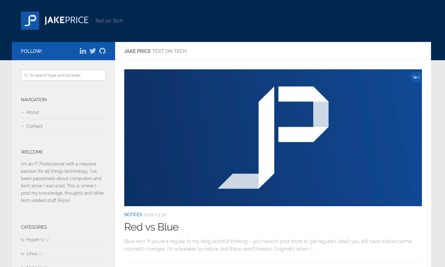
Version 2.0 - The blue one
I felt the blue instantly looked better than the red and gave my blog a more professional feel.
This kept me happy for a while, before the ol’ “I need my own design” feeling came back, and this time I decided it was time to act!
The Strange Case of Dr Jekyll and Mr… Hugo?
As I mentioned, I wanted my own design, but I had also started to grow tired of the Hueman theme, and WordPress. For my needs, I just found they were slow and bulky. I just wanted to write and publish to a quick, clean platform with a simple but effective design.
About this time I had started to notice more and more sites I visited were using tools like Jekyll, alongside GitHub Pages. There’s little quicker than pure HTML and CSS, and that seemed like an attractive idea to look into, it sounded like it ticked the clean/simple box I was after. However, my immediate issue was that I found Jekyll’s documentation to be horrible, and it never really clicked with me when I played around with it. So it wasn’t the solution I was looking for.
Then I discovered Hugo. It was another static site generator and it had much better documentation, so I started to play around with it, and even watched some tutorials on YouTube, and although I got much further than I did with Jekyll, I was just left frustrated with static site generators in general, they weren’t what I was looking for. Perhaps I misunderstood the purpose of them?
I suppose my expectations of simplicity turned out to be the complete opposite of what a static site generator actually is. Having to publish all my post’s from the command line using Git and then build the site is not the level of simplicity I was looking for, and although I love using the command line and it sounds like fun to start with, when all you want to do is write you don’t want to have to mess around with that kind of thing. Additionally, you can’t use your phone, so it wasn’t going to work for me. They just aren’t as simple or convenient as you’d think.
In the end, I just didn’t find what I was looking for and reluctantly decided to stick with WordPress, but instead this time I would find the time to create my own theme, and I did.
Where there’s a Wireframe there’s a Way…
Originally I liked the idea of a site based around a sidebar, with the main content solely on the right, and I put a design together in Photoshop to see how that might look, but ultimately never felt that satisfied with it.
A sidebar wasn’t for me in the end.
Having not really yet decided on any firm direction I found a pencil and some paper and started sketching out some layout ideas, and that’s how I came up with my own, handcrafted design, which I affectionately refer to as the rather unoriginal “version 3”.
Based of my sketches and some basic photoshop wireframes, I spent 5 or 6 weeks building a static prototype site, allowing me to really hone in on the page structure and colour scheme that I wanted to use, as well as something I find really important, typography. There are so many sites out there that give you an utterly terrible reading experience, and I wanted the complete opposite, I was after a clean, elegant reading experience, with no unnecessary distractions, and typography that works.
Once I had built the prototype and was happy with the design I realised that being out of the web development loop for so long had meant that I had completely neglected to make my site responsive! Cue a lot of frustration as I had to retro-fit the prototype to make it fully responsive. Mobile first huh… Mobile was a complete afterthought in this case, and I paid for it with my time and frustration!
After what must have been one or two weeks of real frustration I had gotten the design to a stage that I was mostly happy with. It was good enough, and I just wanted to launch the darn thing at that stage, having spent so long working on it!
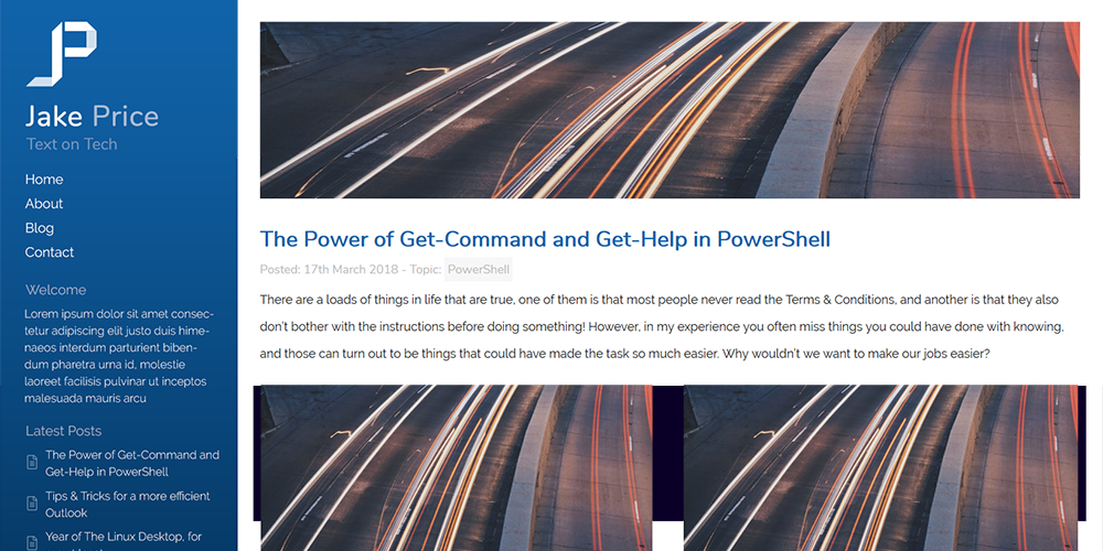
As I still hadn’t found a solution to replace WordPress back then I spent a day or so adapting the prototype into a WP theme and then in May 2018 put the site live.
I was really pleased with it, despite the responsive frustration, and got some really good feedback from colleagues and friends, but it’s amazing how many bugs I had missed and I quickly gathered a long list of issues to fix, probably not helped by being out of touch with web development for so long. Let’s not even mention the horribly unsemantic code, code that I hoped nobody would ever look behind the scenes at. It might have looked decent on the frontend, but the backend was a mess.
In my rush to get my new look up I had rushed it, and hadn’t really thought about how I was structuring anything, so the backend was an embarrassment, but, despite that I was much happier to know my online presence was now designed and created only by me.
After nearly a year of jakeprice.tech, I finally pushed Version 3 out, my own custom design. It had a nice frontend, but an embarrassing backend…
Never Say “Boo” to a Ghost!
A couple of months after launching my own design, my patience finally ran out with WordPress. I was finding it increasingly slow for my needs and I wanted something simpler. I was having real issues getting code syntax highlighting to work properly and was getting fed up of the WYSIWYG editor adding HTML tags to my posts, so I started looking for a new platform, and in July I finally found Ghost.
Ghost ticked all my boxes, it was open source, free if you self-hosted it, and had a clean, unbloated UI and most importantly, a great writing experience, which just let you just write and didn’t get in your way. On top of that, it was integrated with the always excellent Unsplash, so I could quickly find top quality, entirely free feature photos with a few clicks for all my articles.
I jumped right in, and decided to self-host, rather than Ghost’s paid plans, and spun up a VPS on DigitalOcean. I followed the Ghost install instructions, and in minutes I was up and running.
Over the next week, I spent my evening’s porting my WordPress theme to Ghost and by the end of the week was up and running, and with Ghost, I haven’t looked back since - it is still excellent.
Improvements to be made.
Over the next few months I fixed the bugs that I found, but ultimately, although I was happy with the design, as mentioned I was far from happy with the backend. I’m not interested in being a web developer, but I’m handy with HTML and CSS, and I don’t want people that might want to hire me taking a peek at my HTML and CSS and thinking “what must his scripts be like?!”. Sometimes it’s more important to get something out, even if the backend is a bit rudimentary! In this case that had very much been the case.
Starting from Scratch
One year after I deployed v3, I was looking through my code and trying to figure out what I was doing with a certain chunk of CSS I was trying to edit, and I came to the conclusion that I had no idea! I couldn’t see anything changing on the page when I edited it but was certain it did something, somewhere, it’s just my classes were so undescriptive I had no idea if the CSS was used anymore yet alone where. On top of that, I was trying to add a different layout for an “about me” page, and I just couldn’t get it working without adding in a lot more CSS, and I just didn’t want to have to do that, as it was already cumbersome. The problem was, the HTML was really not very semantic at all, and both the HTML and CSS had terribly named CSS properties. It was a complete mess. So, I reluctantly decided it was time for a rebuild. A complete and utter rewrite of the site from the ground up. A present to my site for its two year anniversary!
At first, I was reluctant because I really didn’t want to have to mess around with building anything for the web that wasn’t only going to be used by me, even more so after the mess I made trying to make version 3 responsive, I didn’t want to have all that hassle. So the thought of going through that again was not particularly exciting, but, much to my surprise designing and developing a site mobile first has been a complete and utter joy, a joy to the point that I have rediscovered a love for web design that I don’t feel I’ve had since I taught myself HTML and CSS when I was 12.
Why was it such a joy? I think it comes down to three reasons, firstly, designing a site to work on mobile first, is actually really easy if you do it right, even enjoyable. Secondly, crucial to making it easy was that I discovered the “Toggle device toolbar” button in Chrome Developer Tools (Firefox has a similar feature), which allowed me to effortlessly switch viewport sizes, so I could easily build version 4 to work great with a screen like the iPhone SE, and know that if it looked great at that level I could quickly and easily scale up through screen sizes, whilst adding very little to my media query breakpoints. Thirdly, I was between jobs, so I had lots of time to dedicate to it, and boy did I need it because all in all it’s probably taken over a month of solid work to get it to where I want it.
The “Toggle device toolbar” button in Chrome’s Developer Tools, leads to a really handy viewport adjuster, with preset mobile screen sizes or manually specified ones.
Building Version 4
What I really wanted to accomplish with version 4 was to incorporate lots of the stuff I had neglected in previous versions, as well as fixing bugs I had never got around to fixing. The below four areas were at the top of my list.
- Mobile First and fully responsive
- Easier code maintenance with descriptive HTML and CSS class names
- Simpler, more semantic structure
- Graphic/colour refresh
On top of those core areas, I wanted to add some features that I never got round to adding in v3. Such as a reading progress bar, and a full-screen navigation menu, as well as some smaller things like article sharing links (hardly revolutionary!).
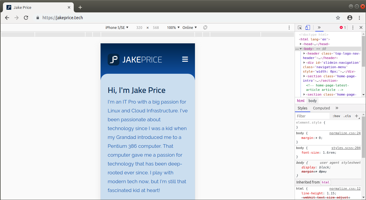
There were things about the frontend design I also wanted to improve as well. I really wanted to update the logo and I wanted to breathe some life into what I thought had become a bit drab - the colour scheme.
In regards to the backend, I initially looked into using a framework, because at that time I wasn’t sure how deep I wanted to go, and I thought I wanted a framework to do the boring stuff for me. The framework I looked at was Bulma, after quickly discounting things like Bootstrap (which seems bloated). I played around with Bulma for a day or two, but realised it was also going to be too bloated for my needs especially after getting away from the bloat of a pre-made “do-it-all” theme with WordPress!
So, in the end, I decided this was going to be a job for me to code from scratch.
All in all, the main bulk of the work took about two weeks, and as I always do, I started by creating a static version of the site, as a prototype, to implement the features I want, and generally get the design and code exactly how I want it, and then test it across browsers to iron out any initial bugs I find. Funny enough though, I must have spent a further three or so weeks after getting the design right, tweaking, adding and removing features, and tidying up the code, as well as bugs that I hadn’t originally noticed.
Mobile First/Responsive
As mentioned, this was the most important part of this rebuild for me. Version 4 has been built to look and work as good on a small smartphone as it does on a full-size monitor, and by building the site to work perfectly at a small resolution first, scaling it up was so much easier. The beauty of CSS is in the C, it’s cascading so I could structure my stylesheet for that smallest resolution, and only have to worry about margin/padding/width and font size as I scaled the site up through my breakpoints. In contrast to how I built v3, this saved me so much hassle and frustration, because it scaled so well. It’s also now much easier to maintain and adjust things on the fly, for instance, if I want to adjust font sizes on a tablet sized screen I can easily do it. If you’re a web developer, and you’re reading this then, of course, I’m stating the obvious in many ways, but it’s been such a big improvement!
Ease of Maintenance
Simple Structure
As I’ve mentioned above, one of the things that horrify me now is how terrible the underlying structure of v3 was. It was embarrassingly bad, and really wasn’t a true reflection of the value I place on good design, its fair to say it was a complete and utter rush job!
Here’s an example. The below HTML is what I was using to display the big feature image on each article I post. So many div’s it makes me twitch. There’s six container div’s before I even hit the main one! That is shocking!
<div id="postimage-bg">
    <div id="postimage">
        <div class="max-container">
            <div class="postimage-container">
                <div class="section group postimage-center">
                    <div class="col span_12_of_12 full-postimage">
                        <div class="post-image-container-full">
                            <div class="post-image-full" style="background-image: url({{feature_image}})"></div>
                        </div>
                    </div>
                </div>
            </div>
        </div>
    </div>
</div>
Compare the above with how I have restructured it below. It does the exact same thing, but in 1 line instead. Not only is it more efficient, but it’s also a lot simpler to see what’s going on if I want to add or edit it in the future.
<section class="article-page-featured-image" style="background-image: url({{feature_image}});"></section>
There should be examples of this across version 4, but it’s an ongoing journey, and I’m regularly looking through to see if there is anything I can optimise and strip down to the bare essentials, without affecting the frontend design.
Descriptive Class Names
Taking the example above, when you are trying to maintain a site where you may not look at the backend often, it can be hard to figure out what is what, especially if little thought has gone into the class names.
Let’s have a look at the class names below. This is the section for displaying the article title and date and tags info from version 3.
<div id="title-bg">
<div id="title">
<div class="max-container">
<div class="title-container">
<div class="section group">
<div class="col span_12_of_12 title-text">
<h1>{{title}}</h1>
<h2>Posted <time class="post-date" datetime="{{date format='YYYY-MM-DD'}}">{{date format="DD MMMM YYYY"}}</time> / <span class="reading-time">{{reading_time}}</span> / {{tags}} </h2>
</div>
</div>
</div>
</div>
</div>
</div>
Below is the same section to display the title and extra information in version 4.
<!-- article title and info -->
<header class="article-page-title">
<div class="container">
<h1>{{title}}</h1>
<p>Posted on <time class="post-date" datetime="{{date format='YYYY-MM-DD'}}">{{date format="DD MMMM YYYY"}}</time> • {{reading_time}}</p>
<p>Tags: {{tags}}</p>
</div>
</header>
<!-- end article title and info -->
In future, this should make it a lot easier for me to remember what is going on across the codebase, because there are fewer redundant tags, and the classes are now a lot more descriptive.
Additionally I’ve added helpful comments to both the HTML and CSS wherever they are needed, and I’ve been much less reluctant to be as descriptive as possible with those comments, because it’ll only help in the future, knowing that much of the code can be easily figured out if I don’t look at it for a while.
Sass Variables
Although I was using Sass variables in v3, I’ve taken it up a notch with v4. I have variables for every colour, margin/padding, width and font property. That’s also across breakpoints where I require them. The variable names match the CSS class, and they are all grouped into sections based on what they do, for example, any variables that control padding, come under the padding section and so on.
This is a revolution for me, as it gives me the ability to for example, easily control the font size of dozens of elements and classes, across all my media query breakpoints. So instead of having to manually adjust a property across all the classes that use it (say a common font size), I can just go to the variable section, get an overview of current sizes and change them easily, and see how they look on the page. I’ve included an example below, the variable names might be long, but the crucial thing is they are descriptive and easy to understand, so who cares how long they are!
$jp_logo-text-h1-h2-fontsize: 2.8rem;
            $jp_logo-text-h1-h2-fontsize_mq-768px: 3.2rem;
                $jp_logo-text-h1-h2-fontsize_mq-992px: 3.2rem;
                    $jp_logo-text-h1-h2-fontsize_mq-1200px: 3.5rem;
Of the few things I am not happy about with v4 it would be how I’m managing margin and padding. There’s room for improvement, as it feels a little bit messy and unstructured at the moment. There’s no easy way for me to update the padding across, for instance, all headings. So that’s something I want to sort, as I can then adapt the site and accommodate changes and tweaks easily in future.
Shorthand Properties
In combination with the Sass variables, I’ve made sure that wherever possible I have either consolidated classes, a particular example being consolidating a:link, a:visited etc to the same line where the colour and font styles are the same, but I’ve also made more use of shorthand CSS properties. A good example is the font shorthand property. I’d never used this before, but now if I am styling a font, I put it all in a shorthand property, and make use of my Sass variables, and because I use a common set of fonts and sizes, stored in my Sass variables, it’s super easy for me to change the font or size across the site. It also keeps me from specifying lots of different font properties which just adds unnecessary bloat. So in combination with my variables, it becomes much easier to maintain.
Here’s an example (I’ve removed the other properties so we can focus solely on the font property, and I’ve also included the line with the value of the variables filled, so it’s easier to see what’s going on).
<!-- with sass variables -->
.article-page-title p { font: $jp_article-page-title-p-fontweight #{$jp_article-page-title-p-fontsize}/$jp_article-page-title-p-lineheight $jp_nonheader; }

<!-- with actual values -->
.article-page-title p { font: 400 1.8rem/3rem Cairo; }
I think that’s much cleaner than specifying those all as separate CSS font properties.
Maybe it’s a Knock-off Framework
Effectively I feel a bit like I’ve ended up creating my own knock-off CSS framework. There’s still work to do in this area, but the core of what I wanted to get from this complete rebuild is now in place and makes it much easier for me to build on when I tweak or update things in the future. Overall I’m delighted with how the backend code has been simplified and improved.
Let’s move onto some of the new features, I’ve added to version 4.
New Features
Fullscreen Overlay Menu
I was never happy with my navigation menu from v3, as it was basically bolted on and was a bit of an after-thought. I tried to make it fit as best as I could, but it didn’t really give me much screen space to add additional links if I ever needed to, additionally I wanted something that gave me more flexibility for things like my social media links, so I really wanted to do it better this time.
I played around with a fully responsive menu that became a drop-down menu when the viewport could no longer accommodate the links, but it still left me with a problem as to where I placed the social media icons, so after much playing around with various options in lots of random CodePens I found on Google, I instead went with a full-screen overlay, that slides-in when the navicon is clicked or touched. I actually found this the hardest thing in the whole design to implement correctly and I must have struggled with it for about a week. I finally found one that worked exactly how I wanted it to on CodePen, and cut it down to size, and it seems to work well and is exactly what I wanted. It gives me the flexibility I was looking for to add more links without my site header looking cramped, and I get to have a cool navicon transition animation!
There are lots of arguments on both sides about the usefulness of such menus, but for my blog, the main focus is on my articles as opposed to some of the other pages I have, so I was happy to have these hidden away behind a click, especially because I gain more space for my menu.

I could click this all day, and be more than happy! I like to think it’s a simple but elegant transition.
Progress Bar
Another thing I have always liked on websites is a reading progress bar, it ties into how I want to make the reading experience top notch, and I’ve always found them helpful for giving you an idea of how far you are through an article. With long reads especially (like this one!), I don’t want to have to scroll all the way down to see whether I have the time to read it, so alongside the native in-built reading time estimate that Ghost has, I think the progress bar really adds to the reading experience.
Can you read this quick?
Finally, I’m going to bring the article to a close with some thoughts on some of the graphical changes to the blog.
Updated Logo, Typography and Colours
New Logo
I hadn’t originally planned to do anything with the logo, as I was relatively happy with it, but I actually designed it a few years ago, well before I was even in IT, so I thought I would give it an update as well.
I’ve been playing around with Adobe Illustrator, and the new logo has been built solely in that, whereas my previous one was done in Photoshop. I’ve always been limited when creating logos in Photoshop, so using Illustrator has given me a lot more flexibility to create exactly what I want, and not have to make compromises because I can’t do something I want to do in Photoshop. It also is, like my site, much easier to manage, and gives me a lot more flexibility in tweaking it at any size and changing colours etc.
I initially sketched out some ideas and thought a lot about which direction I should go in, and from that, I came up with some cool symbols but most would work better for some of my more creative outlets (graphic design and photography). I realised that for my technical site my logo needed to be something more simple, and obvious, so I decided to go with an evolution of what I was using instead of a complete redesign. I want people to look at my logo and know straight away that it’s a “JP” and not be left guessing, especially as I use my logo on my CV as well to help me stand out (it’s worked very well every time I have done so).
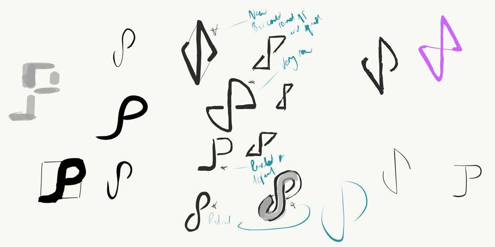
Some very basic sketches to explore some updated logo ideas I had.
Introducing the New Logo
Out with the old, and in with the new. I’ve included a comparison below, with the old on the left, and the new on the right, you should be able to see how I’ve tried to evolve the old one, keeping the sizing and overall feel of the original, but I think improving upon it. I think it’s more approachable.
At its core it’s incredibly simple, and I’m sure somebody out there with my initials has come up with something similar, but with design I like to sometimes forget about worrying about what others think of it and just go with what makes me happy, and I’m really happy with how it’s come out.

Old on the left, new on the right. The new logo is in the spirit of the old, being more of an evolution than a radical redesign.
It took me a few days to pick my favourite from a few variations of the new symbol, and both my family and I liked the one above. I also spent a fair bit of time picking the shades of blue I wanted to use and have gone with a lighter, more vibrant shade.
I have two versions. White on blue, and blue on white. I’m not sure where I’ll use the latter one, perhaps I’ll change it up on social media every now and again, but at the moment I’m using it as the blog’s favicon.

Blue and white versions
In a more normal setting, such as on the blog, you’ll see it against a dark blue gradient, but I also have a version that goes against a light grey/white gradient.
I also decided to update the font I use for the name part of my logo and selected Exo (instead of Cabin). It fits much more with the style I want to portray and is available as a Google Font so I can keep the blog’s logo nice and accessible by using real text instead of just an image of the symbol and text.

New logo against dark and white backgrounds.
If you have a graphic designers mind, I thought you’d appreciate seeing the two variations that lost out, when I settled on the middle one. I like them both, and I actually found it a really tough decision, but I feel the middle option is the right one for me (for now!). You never know I might change my mind in the future, but the differences are subtle enough that few would probably notice if I do sneakily swap them!

I settled on the middle option, but the left and right options were two variations I put together, and I’m still fond of both of them.
I think it’s increasingly important to brand yourself these days if you want to stand out in your career, it obviously helps if you’re passionate about your career, but developing a personal brand is a must in my opinion.
Typography
I’ve also updated the typography, but only slightly, I continue to use Google Fonts as they are so darn flexible, but apart from using slightly different font weights and some size revisions, the only font I have actually changed is the font used for headings. I’ve moved over to using a font called Cairo, instead of Nunito. You can go round and round in circles with typography, and I did, I tried a fair few combinations but I settled on Cairo in the end, alongside Raleway and I think it works well. Otherwise, nothing else has changed on the typography front, and I’m still using Ubuntu Mono for code snippets.
Colour Scheme
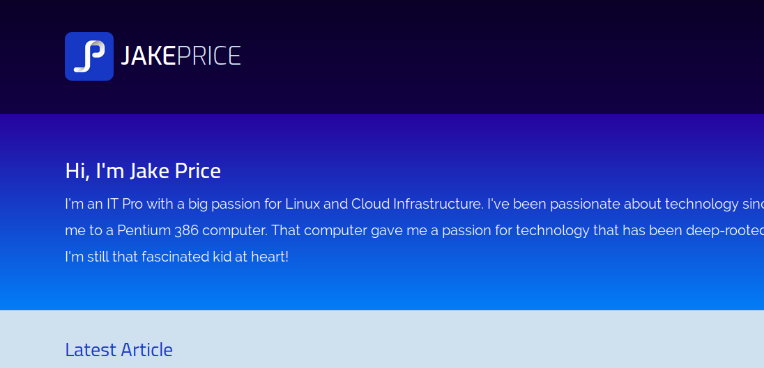
The bulk of the colour scheme hasn’t changed, but with the logo refresh, I’ve added some darker and lighter blues, which are most evident in the updated header and intro/blurb area of the front page. I particularly love the vibrant intro section, and how it contrasts against the main site header. Overall I think the updated colours breathe much-needed life into the design, and to me at least they help make it more exciting, and better reflect my personality. There’s also more of a contrast in colour between the most recent post, and older post sections on the front page, which I think works well.
Much more vibrant, which is very much to my liking.
Code Syntax Highlighting
I’ve also moved away from highlight.js for syntax highlighting and I’m now using Prism, and have adapted it to match my colour scheme. It seems to work better and is easier to manage. It also seems to highlight stuff highlight.js failed to do, so that’s great. I’ve got syntax highlighting in place for more languages than I’ll ever know how to use, but it’s nice to know I’ve covered all bases if I ever want to include a snippet of some random language.
Wow, you made it to the end!
You know what, if you dig around on my blog, there will be some articles where I have mentioned how much I hate web design, and yet this whole process has been so much simpler, because I started with a mobile-first mindset, and it’s really brought my love for web design back.
This post really sums up the process as well, it’s taken me weeks to get the design to the level that I wanted, so it’s apt that when writing about the process it’s become my longest ever article. I applaud you if you’ve read this far!
For me, my blog is a lot of things, it’s not just for me to show off my technical skills, because it also allows me to express my creative side, with that love for good design that I have always had, so I hope you’ve enjoyed this write up, which in itself took about two weeks to write! I’m still tweaking things and optimising the code where I can, but the bulk of the work is very much done.
Thanks for reading, feel free to add any feedback below.